DH199
DH199 Project: User Experience Design in Exploring UCLA Art & Architecture
Samantha Chiu
Project Overview
Project Description:
In this project, I would like to propose the UX design for the walkthrough of UCLA architectures in history. I am motivated to do this project because I want to take advantage of the time I have left as an undergrad to create something for UCLA that will be there forever to commemorate the amazing people who have built these buildings and understand why these buildings are called what they are called. The location-based exploration of the hidden or text-documented history of UCLA can retell the significant meaning to the visitors and the prospective students of how UCLA contributed to the various areas of Humanities, Art and filming, Science and Engineering, and Medical and Biological Sciences. The important building I will be exploring is Royce Hall because throughout my career at UCLA, my main building was Royce and I have a connection to it.
Expected Outcome:
The expected outcome of my project is a map-directory and walkthrough of UCLA architectures in history, specifically focusing on Royce Hall. I will adopt an interactive user-centered design process using methods such as researching literature reviews, conducting user research, creating personas/scenarios, proposing multiple versions of the wire flow (low-fidelity) and interactive prototype (high-fidelity) for usability testing, and evaluate how well I have answered and concluded my research question.
10-week Project Schedule:
-
Week 1 Introduction and Citi Certificate -
Week 2 Literature Review and Secondary Research -
Week 3 Field Research Plan -
Week 4 Field Research Findings -
Week 5 Personas and Journey Maps -
Week 6 Wireflows and Sketch of Prototype -
Week 7 Low Fidelity Prototype -
Week 8 High Fidelity Prototype -
Week 9 Usability Testing -
Week 10 Finalize Report
Literature Review & Secondary Research
Research Question:
How does the user experience design of a location-based map, filtered searches, and a sharing platform help engage users to increase their understanding and connectedness in the history of architecture?
Proposal Topic / Keywords:
location-based map, design, engagement, storytelling, filters, personalized, tour, history of architecture, user experience
Literature Review:
Mobile learning has become an effective way to educate individuals in the 21st century. We are constantly on our phones and spending most of our days browsing through the web on our little screens. From the book, Mobile Design Pattern Gallery: UI patterns for smartphone apps, Neil goes through different design techniques that can improve mobile applications. He states that having an interactive preview in applications where users can zoom in and feel connected to the information can help with the design of mobile apps.Therefore, technology has become something we can work with to learn and gain knowledge. “The digital has rapidly become a significant medium in the ‘nexus of historical meanings and experiences’” (Smith, Lewi, Nichols, 2018). Smith, Lewi, and Nichols reflect on the design of a mobile app that is supposed to share the history of Port Melbourne through collaboration from other’s knowledge of the history. In their paper ‘PastPort’: Reflections on the Design of a Mobile App for Citizen Heritage in Port Melbourne, one of the most outstanding things they noticed was that they hoped the application would focus on a smaller locality so that the individuals sharing historical information would also focus on a certain part of the city and that there would be a higher interest in sharing information. People can become overwhelmed with too much information if the area of focus is so broad. Additionally, Smith, Lewi, and Nichols insists that researchers and designers take advantage of the technology we have today. They explain the importance of using interactive maps and contemporary digital technologies such as pinned map locations, so users are more inclined to use it. Especially with technology constantly improving and evolving, we need to keep updating the different technologies used for any mobile application.
Understanding the history of architecture can be difficult when individuals are not provided with accurate techniques and skills to visualize the buildings. Allais explains in the chapter of his book RENDERING: On Experience and Experiments that one of the most important aspects of allowing others to be engaged in history is to render the buildings and structures. In order to render, one must be able to visualize them through images. Images are a great way for others to see the story visually and understand the deep history of many architectural buildings. In the book Visual Spatial Enquiry - Diagrams and Metaphors for Architects and Spatial Thinkers, Creagh and McGann explain the usefulness of spatial research in comprehending architecture. When there is a complex concept, it is easier to visualize through an image. This idea of visualizing space can help individuals with new and innovative propositions that can reshape the relational settings. Not only do individuals have more blank space to innovate, but it also looks more aesthetic for the eye to look at. In spatial research, one of the methods used is to synthesize complex concepts into blank space and eventually turned into a succinct picture. Creagh and McGann explain the three most important concepts for editors with architectural backgrounds are seeing, doing, and making space. Especially when individuals are looking at an interactive map, they can see the overall concept of the map, do the task that they want to do, and make space on the map to see it.
Other than visualizing space through an application, interactive models are also as important. From the book, Mixed-methods research: A new approach to evaluating the motivation and satisfaction of university students using advanced visual technologies, Fonseca, Redondo, and Villagrasa explain the usefulness of interactive tools that signify 3D architectural modeling. The authors talk about the advantages and disadvantages of using this type of technology to evaluate different types of architecture throughout history. Especially with the dense information about historical facts on different types of buildings, it can be helpful for users to visualize this storyline through interactive tools. This can allow the users to become more immersive with the information and feel more connected to the history. The images of the maps have to look realistic for the users to imagine themselves standing in front of the building. The interactive model can also help individuals become more technologically advanced by understanding how to use these tools. In the book chapter, Context-Architecture and the Genius of Place, Parry talks about how the importance of context of the architecture must be taken into account in every step of the design process. Especially in Chapter 3 Simultaneity, he talks about what happens when two events happen simultaneously and how context becomes an important aspect that we have to consider. In general, context is an important concept in any form of history because people are understanding the history from the authors point of view. For example, context of what is going on within the time that people might be using the app is as important. Users will be more inclined to use and understand the history of architecture when it is relatable to their lives and their generation.
I also looked at a similar mobile application, London Architecture Guide, where it allowed users to look at different architectures in London. The main screen is an interactive map for users to scroll through. However, I wish that there was a satellite view of the map to look more realistic and eye-appealing. If you zoom in, there are many blue dots to show the different architectures, as I think it would have been better to color coordinate the different types of architectures so users know the difference. I liked that the application gives the users the option to choose through the architectures through a list. I believe that the history of the architecture itself is quite wordy as if I was a tourist using this application, I would like to read more historical fun facts about the buildings rather than a history report. Overall, I feel the application has a lot of features for individuals to use, but the user interface and design can be improved to better attract the users.
Citations:
Creagh, R. (Ed.), McGann, S. (Ed.). (2019). Visual Spatial Enquiry. London: Routledge, https://doi.org/10.4324/9781315182766
ALLAIS, L. (2020). RENDERING: On Experience and Experiments. In Alexander Z. & May J. (Eds.), Design Technics: Archaeologies of Architectural Practice (pp. 1-44). MINNEAPOLIS; LONDON: University of Minnesota Press. doi:10.5749/j.ctvtv938x.5
Fonseca, D., Redondo, E., & Villagrasa, S. (2015). Mixed-methods research: A new approach to evaluating the motivation and satisfaction of university students using advanced visual technologies. Universal Access in the Information Society, 14(3), 311-332. doi:10.1007/s10209-014-0361-4
Neil, T. (2014). Mobile design pattern gallery: UI patterns for smartphone apps (Second ed.). Sebastopol: O’Reilly Media.
Wally Smith, Hannah Lewi & David Nichols (2018) ‘PastPort’: Reflections on the Design of a Mobile App for Citizen Heritage in Port Melbourne, Australian Historical Studies, 49:1, 103-125, DOI: 10.1080/1031461X.2017.1407350
Parry, E. (2015). Context-Architecture and the Genius of Place. AD Primers Context. John Wiley & Sons Ltd, 78-105. DOI:10.1002/9781118945674
User Research Planning
Activity:
The main activity of my project would support the users to understand the history of the main architectures, like Royce Hall, at UCLA. According to Maslow’s Hierarchy of Needs, some specific users, like UCLA students would need the social belonging involved in this activity. The “social belonging” is the third level of the human needs of Maslow’s pyramid and is related to understanding the history of the different architectures at UCLA. Depending on the type of user, one can feel a sense of belonging after understanding the history because they can be a student there themselves. However, if users were visitors like parents or friends or even potential students, they might strive for a sense of connectedness to their personal lives so they can feel psychologically closer to important buildings that represent UCLA. It can potentially increase their experience at UCLA and create a positive memory towards UCLA brand identity. They can also simply enjoy the beauty of the different parts of the physical building itself and its meaning with it.
Solutions:
The current or traditional solution that would satisfy the needs of the users is researching what you want to know about UCLA on your own through Google or the school website so you know more about the history. You can also walk through campus on your own and try to find monuments that provide some history about the buildings. Some limitations that possibly would be improved with digital technology is a location-based tracker where it can automatically track where you are on campus and provide immediate fun facts on the building. Therefore, it is more convenient and more efficient to get around campus, while learning about the history and feel more connected to the school.
Target Users:
The different types of users that might use this app include college students, high school students preparing to come to college, alumni, tourists, and professors or staff that work at UCLA. I want to focus mainly on new college students, prospective students, and alumni because I feel that the app would benefit them more. They would use the app when they are walking around campus and want to learn more about the different architectures. The goal of the user is to feel more connected to UCLA and know more about the history of how it got to where it is today by using certain design features.
Context and Research Method:
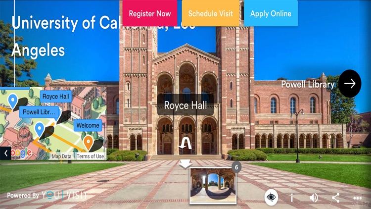
The research methods I decided to do are phone interviews with one of the campus tour guides at UCLA, experts of architecture, college students, parents, and post-grad students. I will start with the campus guide. Campus tour guides are well-trained students that tour prospective students and parents around UCLA and tell them about the history and fun facts of UCLA. In this virtual phone interview, I will be directly asking questions about giving tours at UCLA and the type of information said on the tours. I hope for the interview to be around 30 minutes and I will be doing it in my room around noon time. Additionally, I will be doing the rest of the interviews through text messages to different users so I can gauge the interests of the different users. I will also be looking at the UCLA virtual tour on their website for an observation. I will use the virtual tour like I am a prospective student and have never been on the campus or know anything about UCLA. Then I will jot down notes on what I noticed and observed through the virtual tour.
User Research Data & Findings
| UCLA Virtual Tour |
|---|
 |
Field Research Script | Interview Transcript | Audio Recording Interview | User Research Data ——————– | ——————— | ————————- | ———————- view…|view…|view…|view… ———————–
Findings & Analysis:
Keyword Finding

Keyword Grouping

To analyze my data, I decided to do a keyword finding by looking through all of my interviews. I listed all the important keywords and grouped them into sections that I felt went together. From the groupings, I found 5 new categories.
- Flexibility
- Detailed Design & Appearance
- Context & Experience
- Process of History
- Feeling Connected & Included
Reflection:
Throughout this process, I learned the techniques in conducting a phone interview for my research. Through my research, I found that the user’s needs are the accessibility to the application, the connection to others and themselves, and the importance of an interactive and in-person walkthrough of the campus. Some design requirements would include an interactive and personable map where users are able to feel like they are actually on campus exploring the buildings, and features that allow users to filter the information to the specific user wants and needs. The analysis of my categories helped me understand the different design elements I would need to implement in my application. For flexibility, the use of filters will provide users with a personalized tour and give them the flexibility that they want. As for the detailed design and appearance, I believe the use of detailed images and close-ups of the buildings will help users in seeing the beauty of architecture. The process of history will also be included with the type of information on the tours. I will design an activity feed and an option for users to share their stories and experiences to address the topic of the feeling of connectedness and inclusion at UCLA. Lastly, the context and experience category will be addressed by having an interactive map and contextual search for users to have the personalized experience that they want to feel on campus. It allows them to truly experience what it is like to be at UCLA, wherever they are. To add on to the experience of the user, I will also design a “live” tour version for them to feel the welcoming feel of UCLA.
User Persona & Journey Maps


Task 1: Isabella’s Architecture Tour with Interactive Map & Contextual Search:
Isabella comes back to UCLA for an alumni panel for careers focusing on art and architecture, as she is working to be an architect. She misses the school and wants to see if anything has changed since she was there. She walks by Royce Hall to try to feel that welcoming feeling that she always felt when she walked around the school. Isabella wants to admire the beautiful architecture of the building and starts to think back to all the times when she was a student and walked by Royce but have not fully enjoyed all the designs and history that is in that building. Because she is a graphic designer that designs different parts of buildings, she can’t help but wonder who built Royce and why this designer decided to build the building in this way. She tries to look up some basic information but all it gives her is Jstor scholarly articles that she does not want to read through and comprehend. Instead, she can now use the app, LArc, and use the interactive map on the app for easy and accessible directions around UCLA. LArc will give you the option to click find your location (if you are actually on campus), search up a specific building you want to learn about or start a complete historical architecture tour. Isabella would first click her location icon so the app can locate where she is. She is also to move around the interactive map if she wants to and then clicks on Royce Hall. It then gives her a first-person POV like she is standing in front of Royce. She notices that the building itself is vibrating and says “tap me to learn more” and a button that says “Start Tour”, so she taps the building and it will provide an easily readable summary of the historical facts of the architecture and fun facts about the building. The app focuses on the picture scroll through for different detailed and close-up images of Royce Hall from 1919 to now.
Task 2: Isabella’s Story and Activity Feed:
Isabella learns a lot of historical information about the architecture of Royce Hall and is very satisfied. However, she wants to have more of a personal connection to the building and is curious about other people that have encountered Royce. She can use LArc to go to the activity feed icon and notices the default page is UCLA. Isabella types Royce Hall in the search bar and it brings up an image and a public discussion forum of how others have experienced this building. People can share their stories and comments that they want others to hear about too, and feel a real connection to how people spend their time there enjoying the art of the building. She favorites one of the comments in the public forum. Isabella also wants to leave her own story and picture to mark the date that she has learned so much about the building itself. She then clicks on the Add icon on the bottom of the screen and a drop-down menu shows up to allow her to choose the building she wants to write about. She chooses Royce Hall and adds her comment to the forum. She clicks posts and sees her comment show up in the activity feed. She feels more connected to UCLA now because she was able to learn and share her story.
Task 3: Isabella’s Personalized Tour with Filters:
Isabella wants to learn more about Charles E.Young Research Library because when she was a student there, the library was not finished remodeling yet. She goes back to the home page of the interactive map and searches up “Charles” where a drop-down bar pops up with Charles E. Young Research Library. She clicks on it and it brings her to the Charles E. Young tour page. Before she clicks “start tour”, she wants to personalize the tour because she only has 15 minutes to go through the tour. She clicks the filter button and it gives her options of the duration, type of tour, and route of the tour. She chooses 15 minutes, a “live” tour, and the highlights route so she can just learn about the main things of the library. She clicks start tour and she watches the “live video”. She wants to see what buildings are nearby the library, so she clicks on the “Near Me” button and it brings her to a page of the buildings that are nearby. She notices that she can filter through what she wants to be listed nearby as well, such as restaurants or libraries or just buildings. Then she clicks on one of the buildings that are listed as nearby called “Dodd Hall” and watches the tour for those buildings as well.
Wire Flows and Sketch of Prototype:

User’s Feedback:
| User 1 | User 2 | User 3 |
|---|---|---|
 |
 |
 |
The user’s overall feedback is to add be more clear with my buttons because they were unsure where to tap or where to go. Also, I should be more clear with some of the words, such as “Message us!”. There were suggestions on adding incentives for users within the geo-tag section where users can get free vouchers for things to do at UCLA. Additionally, I should work on my filters for my directions sections so it is clear to the user which button to select and how many.
Low-Fidelity Prototype
Interactive Map and Visual Tour:

Activity Feed and Sharing Stories:

Personalized Tour and Filters:

Low-Fidelity Testing:
Testing:


I tested my low-fidelity prototype with 3 different potential users. One of the users are a college grad, another was a student in college, and one was a parent. The college grad and college student went through the prototype quite quickly but had some trouble following some of the screens and getting to the next screen. She also gave ideas on adding features like “liking a post” so that users can engage in the posts. The parent had a bit more trouble with understanding certain screens and flow. He understood the main function but did not know what some of the icons meant.
Revisions:
- Using the “my location” feature as part of the interactive map so that users can “use” the map and interact with it
- Changing the layout of the tour by changing the screen to emphasize the pictures and detailed visuals of the building rather than the bullet points of the facts
- Showing more of a bold feature by changing the color of the like button so users can see it better
- Leaving the filter icon on the screen so users know when they are in the filters setting
High-Fidelity Prototype
First Draft of High-Fidelity Prototype:

Second Draft of High-Fidelity Prototype:
Interactive Map

Visual-focused Self-Guided Tour

Activity Feed and Sharing Own Story

Personalized Tour with Filters

Link to live high-fidelity prototype
Changes from Previous Iterations:
Task 1: Interactive Map and Visual Tour
Originally, I had Isabella use the interactive map while she was not on campus, but after multiple testing and research, I realized that it would be helpful to see Isabella use the interactive map while she was there so she can use the “find my location” feature and move around the interactive map. I also changed the format of the tour to focus on the visual images of the architecture rather than the words and facts. I used a swipe up and swipe down feature so it is easy for users to navigate.
Task 2: Isabella’s Story and Activity Feed
The only changes I made here was to make it more clear for the user to use the “drop down” when you choose the building you want to write about. I added a down arrow so users will be able to see it better. I also changed the wording of “save” to “post” and added a “draft” feature so that users can save their comment for later.
Task 3: Isabella’s Personalized Tour with Filters
Some things I changed in this task was the wording of the “save” in the filter to “start tour” so that users know that after choosing their options, it will start a personalized tour. Instead of “Step-by-Step Itinerary”, I changed the feature to “Near Me” so that users can see what buildings, food, or libraries are near the building they are touring. This “Near Me” page is also interactive, where it allows users to skip ahead and go to the place that they want to see.
Color Palette:
I decided to change the color of my application because I wanted a color that was more eye-catching and brighter so that users will immediately notice the different colors on the app. I also wanted to keep the theme of UCLA with the blue and yellow colors. I chose a brighter yellow because I wanted users to feel happy and welcomed to use the app and associate it with the institution. The blue is similar to the shade of yellow, where it is bright and exciting, yet contrasting the yellow so that users will see the color immediately.

Usability Testing
I tested my high-fidelity prototype withh over 5 potential user individuals where I either had to do it through an online zoom call or in person if accessible. 4 out of the 5 testing was online while one of them was in my home. I decided to test users who were mostly in college already and had some interest in history or architecture. All of the partipants are around the same age and similar demographics (20-27). They also all have a connection to UCLA in some way, but their experience levels differ. They all filled out the google form as I walked them through the testing and tasks. I asked them to think out loud so that I can hear their commentary. Overall, all the users were able to complete the tasks in a timely manner. The top 3 words that the participants would call my app are creative, professional, and impressive.
The tasks I asked them to do:
- Take a tour of Royce Hall using the interactive map
- Share your own experience and read about others
- Personalize your own tour to fit your schedule
Revisions:
Some design revisions I made from the usability testing were changing the icon for the “find my location” in the interactive map because I realized there was a more up-to-date icon that people would recognize more. Additionally, I moved the location of it to the top right of the screen because most users are right handed and have a tendency of looking on the right side and top first. Furthermore, I added a title on the page where users share their experiences about the architecture so that it is more clear what page they are on. If I had more time, I would also want to have a quick walkthrough of the app when a new user signs in or downloads that app so that they would have a basic understanding and know the functions of the icons and where everything is.
Link to Usability Testing Videos & Data
Evaluation
Overall, the data shows that we can use design features better understand the history of architecture and tell your own story. From analyzing the data collected from my usability testing, I believe that I was able to answer my research question. I found that design features, such as location-based interactive maps, personalized searches, and activity feed platforms help user feel more connected and allows them to learn more about the history of architecture. According to my data, about an average of 88% of users were able to complete the tasks in an efficent manner and thought the tasks were easy (100% being easy). To measure the connectedness the users felt to the history due to the design features, I asked users to answer a question regarding their “connectness” to the history of architecture. An average of 75% of the users thought that they felt the most connected to the history of the architure from the specific design features. Their average answer was “somewhat likely”. Therefore, I believe that I was able to answer my research question. However, if I had more time, I would want to learn more about how users felt when they performed each of the tasks using the design features, such as the interactive map or the personalized filtered search so that I can get a better understanding of how they felt connected to the history.